
LIMITLESS AT 30
Client
Edsa Shangri-La, Manila
Project Duration
July to August 2022
Project Type
Corporate Communications
Graphic Design
Art Direction
Visual Identity
Tools
Adobe Illustrator
Adobe InDesign
Adobe Photoshop
In 2022, Edsa Shangri-La, Manila (ESL) marked its 30th anniversary with Limitless at 30, a milestone campaign that celebrated the hotel’s enduring presence in the hospitality industry. Developed by our Marketing Communications team, the concept drew inspiration from the resilience of legacy institutions and the symbolic weight of the number 30—often associated with creative expansion, optimism, and the promise of reinvention.
I translated these ideas visually through a custom infinity-inspired “30” symbol, paired with a modern sans serif wordmark and a refined blue-green palette evocative of water and the hotel’s signature lagoon-shaped pool. Throughout the design process, we prioritized our General Manager’s vision for minimalism, paring back ornamentation in favor of clarity and elegance. The result was a campaign that honored ESL’s heritage while signaling a fresh, forward-looking identity. Ultimately, the work was well-received and praised by leadership for its memorable visual language and its role in achieving the campaign’s communications goals.

Image courtesy of Edsa Shangri-La, Manila
RESEARCH
01
Brand: EDSA SHANGRI-LA, MANILA
Shangri-La Hotels and Resorts is a multinational hospitality company, founded in 1971 by tycoon Robert Kuok and bearing the name of a Far Eastern mythical land of contentment depicted in the 1933 novel Lost Horizon. Kuok opened Edsa Shangri-La, Manila (ESL for short) in 1992, which became the first Shangri-La hotel in the Philippines. Known as "Your Urban Oasis", ESL reached a major business milestone as it celebrated its 30th anniversary.
THE BRIEF
02
THE WORK
To create a campaign that celebrates 30 years of success and inspires optimism in the hotel's stakeholders and regular patrons.
THE PROBLEM
How do we honor three decades of excellence while embracing the infinite potential of what’s next?
THE SOLUTION
Present our anniversary campaign as not only a celebration of a rare business milestone but also a promise of bigger and brighter things for the hotel's limitless future.
AUDIENCE
-
Current stakeholders and investors.
-
Potential investors.
-
News outlets and media.
-
General public.


Image courtesy of Edsa Shangri-La, Manila
CONCEPTS
03
During the early brainstorming stage, our team dove headfirst into shaping the overall look and feel of Edsa Shangri-La, Manila’s big 3-0. We knew it had to be visually memorable—it’s not every day a hotel turns 30! My teammates and I explored the deeper meaning behind the number 30, pulling inspiration from everything from traditional anniversary gifts (hello, pearls!) to numerology, to help build out strong, meaningful concepts for the campaign.

Classic Pearl Elegance
This concept offers a more literal and timeless interpretation of the pearl: refined, elegant, and celebratory. It embraces the luxury and heritage of Edsa Shangri-La, Manila, using rich textures and visual depth to elevate key elements like imagery and copy. This direction leans into sophistication and grandeur, perfect for marking such a milestone anniversary with style and substance.

Iridescence
Inspired by the luminous quality of pearls, especially rare rainbow orients, this concept reimagines pearl iridescence through a contemporary lens. Using soft mesh gradients and modern color transitions, it blends classic luxury with fresh design sensibilities. It symbolizes ESL’s graceful evolution over time: embracing the new while honoring the elegance the hotel is known for.
CHOSEN CONCEPT

Limitless Possibilities
Rooted in the symbolism of numerology and the phrase “ad astra per aspera”, this concept channels galaxies to reflect 30 years of dreams, challenges, breakthroughs, and vast possibilities. The theme celebrates Edsa Shangri-La, Manila’s journey and imagines the next chapter as one filled with infinite potential. A celestial color palette and cosmic visuals embody the spirit of optimism, transformation, and looking boldly toward the future.
Out of the three concepts, Limitless Possibilities became the springboard for what would eventually become our final direction. At first, we went full cosmic: leaning into stars, galaxies, and all things astronomy to capture the “limitless” theme. But as our General Manager kindly pointed out, it was close… but no cigar. Turns out, he thought that the visuals were a little too out-of-this-world—literally. So, we regrouped.
That’s when it hit me: the answer wasn’t in the stars, but right here at home. I began to see ESL not just as a hotel, but as a place that had grown and evolved over 30 years, shaped by its people, guests, and spaces. I rebuilt the concept with a new lens, one that flowed more naturally. Drawing inspiration from ESL’s identity as “Your Urban Oasis”, I anchored the visuals in water. Our lagoon-shaped pool became the central motif, and the watercolor animation style brought a sense of fluidity and warmth to our videos—like painting the canvas of our journey, one memory at a time.


Logo Study 3
After some thoughtful conversations with our hotel’s General Manager, we knew we were close—but one final tweak brought it all home: removing the tapering to make the "30" more immediately legible. The outcome? A sleek, solid form that balanced clarity with symbolism—a perfect mark to celebrate three decades of excellence.

Logo Study 2
This second logo study also builds on the infinity symbol, but this time merges it with the Arabic numerals for 30. It’s a bit more direct in approach, connecting the 3 and 0 to subtly mimic the form of the infinity loop—almost like a flowing signature. There’s also a faint “S” shape embedded in the design, adding a touch of movement and dimension. Beyond its visual rhythm, that “S” also gives a quiet nod to Shangri-La itself—a small detail with big meaning.
Logo Study 2
Building on the previous iteration, this second logo study places more emphasis on the number 30 than the infinity symbol. It wasn’t my strongest contender, but I’ve always believed that good design thrives on trial and error—sometimes you have to sift through the rough to uncover that rare diamond.

Logo Study 3
For this third logo study, I built on the previous iteration by leaning into the more formal, recognizable shape of the infinity symbol and fusing it with the Arabic numerals of 30. This time, I created two intertwined infinity symbols—one for each digit—so the "3" and the "0" each took on their own loop. The result was a cleaner, more digestible design where viewers could clearly distinguish the numerals while still feeling the sense of limitless motion. I used tapering to help blend the edges of the numbers into the curves of the infinity symbols more seamlessly.
Logo Study 1
This logo design is a mashup of the infinity symbol (∞) and the Roman numerals for 30 (XXX), brought together as a sleek, monogram-style icon with a modern twist. I leaned into a more contemporary look while keeping meaning at the core. The three diagonal lines? They’re not just for show—they’re tilted upward on purpose, symbolizing ESL’s strong, forward-moving trajectory. A nod to growth, momentum, and the next 30 years ahead.

BRAND DEVELOPMENT
04
Once we got the green light for the final concept, I rolled up my sleeves and dove straight into building the visual identity for ESL’s 30th anniversary. The logo needed to embody the spirit of being Limitless, so I drew inspiration from the infinity symbol and the number 30. I went through a bunch of explorations from Roman numeral mashups to playful looping curves before landing on a clean, flexible mark that fused them together. The result? A custom symbol that merges two infinity loops with the number 30, visually tying together ESL’s past, present, and future. A fitting start to a milestone celebration. Scroll through the gallery below to see my progression with the campaign's logo.


FINAL LOGO
05
The final logo for Limitless at 30—which also became the official name of the anniversary campaign—is a combination mark featuring a clean Helvetica Neue wordmark alongside a custom double-infinity-30 symbol. The design incorporates varying shades of teal as a deliberate nod to the hotel’s iconic lagoon-shaped pool and its long-standing tagline, “Your Urban Oasis.” More than just a color choice, teal was selected for its symbolism of revitalization, perfectly echoing the campaign’s message of growth, transformation, and fresh beginnings. Helvetica Neue, with its modern yet timeless character, reinforced the minimalist, elegant tone we aimed for throughout the campaign.
(White).png)
White logo on dark background.

Logo animation for Limitless at 30. Colored logo on white background.


TEASER VIDEO
06
One of the key executions for the campaign was a teaser video designed to build anticipation for Limitless at 30. The initial concept involved commissioning a watercolor artist to illustrate the hotel’s lagoon-shaped pool, but when that plan fell through, I pivoted. Determined to preserve the original vision, I took it upon myself to learn how to create a watercolor animation using After Effects and Photoshop, pulling together tutorials and experimenting with different techniques. The result was a handcrafted, animated piece that not only honored the original idea but also added a personal, expressive touch to the campaign’s kickoff.

SOCIAL MEDIA
07
Some of the bigger video outputs for this campaign involved tapping into nostalgia. I put together clips that featured how far ESL has come since its beginnings in 1992 to where it is now in 2022. The minimalistic branding of the campaign trickled into the social media outputs via the contemporariness of the chosen typeface, Helvetica Neue. More in-your-face videos about the anniversary employed the use of the watercolor animation.

PR MATERIALS
08
Designing the PR materials was like solving a very pretty puzzle. Our General Manager preferred clean, modern layouts—and I was totally on board. The challenge? Making minimalism feel interesting and not just “plain white with vibes.” I spent time experimenting with balance, composition, and negative space, and in the end, I was genuinely proud of how elegant and on-brand the materials turned out. Minimalism? Conquered.
Limitless at 30
Media Launch menu

Limitless at 30
PR invites for Appreciation Night
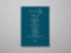
To kick off a successful anniversary campaign, we knew our first impression had to count, especially with the press. With journalists, foodies, and influencers on the guest list, our Media Launch event needed to reflect the same thoughtfulness and polish as the rest of the 30th anniversary. Partnering with our hotel’s food and beverage outlets, we curated a refined experience, and I designed the event menu. I took a minimalist approach, using bold typographic contrast to create something elegant yet memorable. The result was well-received, with our General Manager personally praising the design for its impactful simplicity.
Another key PR piece that needed to make a strong impression was our invitation to Appreciation Night, the final and grandest event of our 30th anniversary. This night served as a heartfelt thank you to our business partners, media contacts, influencers, and VIPs who’ve supported the hotel over the past three decades. Since the event was a culmination of everything we’d celebrated, the invites had to feel elevated yet cohesive with the rest of the campaign. I created animated digital invitations (in GIF form) that leaned into a minimalist but striking approach. Using a new watercolor animation of our iconic lagoon-shaped pool at night, I paired this with a rich teal background on the copy-only frames—signaling an evening affair while keeping everything sleek, clean, and on-brand.
PR MATERIALS
08
Designing the PR materials was like solving a very pretty puzzle. Our General Manager preferred clean, modern layouts. And I was totally on board. The challenge? Making minimalism feel interesting and not just “plain white with vibes.” I spent time experimenting with balance, composition, and negative space, and in the end, I was genuinely proud of how elegant and on-brand the materials turned out. Minimalism? Conquered.
MERCH
10
I have to admit—this was one of my favorite parts of the campaign because I got to dip into packaging design. I conceptualized a limited-edition caramel and coconut chocolate bar to be sold at The Bakeshop, our hotel’s lobby-level patisserie and confectionery. For the packaging, I incorporated a subtle water pattern inspired by Limitless at 30 and ESL’s identity as “Your Urban Oasis,” nodding to our iconic infinity pool. While the campaign's branding primarily used Helvetica, this chocolate bar had to align with The Bakeshop’s existing retail chocolate line, which meant using the line’s designated typeface instead. This decision ensured consistency across the product range, allowing the bar to stand out as a commemorative item while still belonging to the overall family of chocolates we sell year-round.
MERCH
09
I have to admit: —this was one of my favorite parts of the campaign because I got to dip into packaging design. I conceptualized a limited-edition caramel and coconut chocolate bar to be sold at The Bakeshop, our hotel’s lobby-level patisserie and confectionery. For the packaging, I incorporated a subtle water pattern inspired by Limitless at 30 and ESL’s identity as “Your Urban Oasis,” nodding to our iconic infinity pool. While the campaign's branding primarily used Helvetica, this chocolate bar had to align with The Bakeshop’s existing retail chocolate line, which meant using the line’s designated typeface instead. This decision ensured consistency across the product range, allowing the bar to stand out as a commemorative item while still belonging to the overall family of chocolates we sell year-round.


The lager was a collaboration with Engkanto, a local craft brewery in the Philippines. I worked closely with the Engkanto team (under the supervision of my direct manager) to design a label that would seamlessly merge the Limitless at 30 identity with Engkanto’s established brand. While I initially explored several layout options, we ultimately decided to make the “30-infinity” icon the most prominent visual element to reflect the anniversary campaign. However, to maintain consistency with Engkanto’s existing product line, we used their signature “LAGER” typeface on the label instead of our campaign’s Helvetica, striking a balance between the hotel’s milestone branding and the brewery’s distinct visual identity.

LET'S CHAT!
I want to work with you so shoot me an e-mail, so call me, beep me if you wanna reach me.

